.svg)
This release simplifies Keeper's mobile experience, strengthens the systems that protect Photo Testing results from unreliable ratings, and smooths out a collection of onboarding, loading, and layout edge cases.
We redesigned the mobile navigation to be simpler and less visually crowded.
The Keeper logo and hamburger menu have been removed from the top bar, with the menu moving into the bottom navigation as a fifth item. We also removed the text labels from the bottom navigation, leaving a cleaner, icon-only interface that keeps primary destinations within easy reach.
This release improves the first moments of Keeper, helping new members understand how the process works and why thoughtful answers matter. It also adds a new default preference for how much appearance should influence match evaluation, giving the matching engine a clearer signal for balancing physical attraction against every other dimension of compatibility.
Alongside these additions, we further refined attraction modeling, preference weighting, IQ-signal validation, and performance throughout the experience.
New members will now see a welcome card at the beginning of onboarding that briefly explains how Keeper works and why the information they provide matters.
By providing this context before the first question, users can better understand the process and why complete, thoughtful answers lead to more accurate matchmaking.

Every member now has a default preference asking how important appearance is to them overall. Like any other preference, it can be assigned a priority and ranked alongside the other qualities that matter.
Two people may have similar physical tastes but place very different importance on appearance when evaluating a long-term partner. This gives the matching engine an explicit signal for handling that trade-off instead of having to infer it directly.
This release introduces Keeper V3, a major redesign of the Keeper experience built around one principle: asking the most useful question at the most useful time.
Instead of moving through static questionnaire modules, Keeper now gives you a single prioritized feed of tasks, one at a time. Each step is selected dynamically based on what will most help the matching engine evaluate your current possible matches.
Keeper V3 replaces module-based question flows with a single-card question feed.
Instead of answering large blocks of questions that may or may not matter for your current pool, you'll now see one prioritized question at a time. The feed is dynamic: Keeper serves the question most likely to clarify your match prospects right now. This means less busywork, no irrelevant questions, faster progress toward a real match, and a clearer sense of what Keeper needs from you next.
If a question matters for your current possible matches, it rises to the top.
Keeper V3 also brings Photo Rating directly into the core matchmaking loop.
If learning your physical type is the most important next step for evaluating your current possible matches, Keeper will ask you to rate photos in real time. Those ratings help the AI understand what you are and are not attracted to, so physical compatibility can be evaluated with more precision.
V3 does not only ask standard profile questions. Keeper can now generate match-specific disambiguation questions on the fly.
For example, if a promising match is a vegetarian, Keeper may ask:
"Are you open to dating someone who is vegetarian?"
These questions are generated based on the actual people in your pool and the details that matter for deciding whether a specific match should stay under consideration.
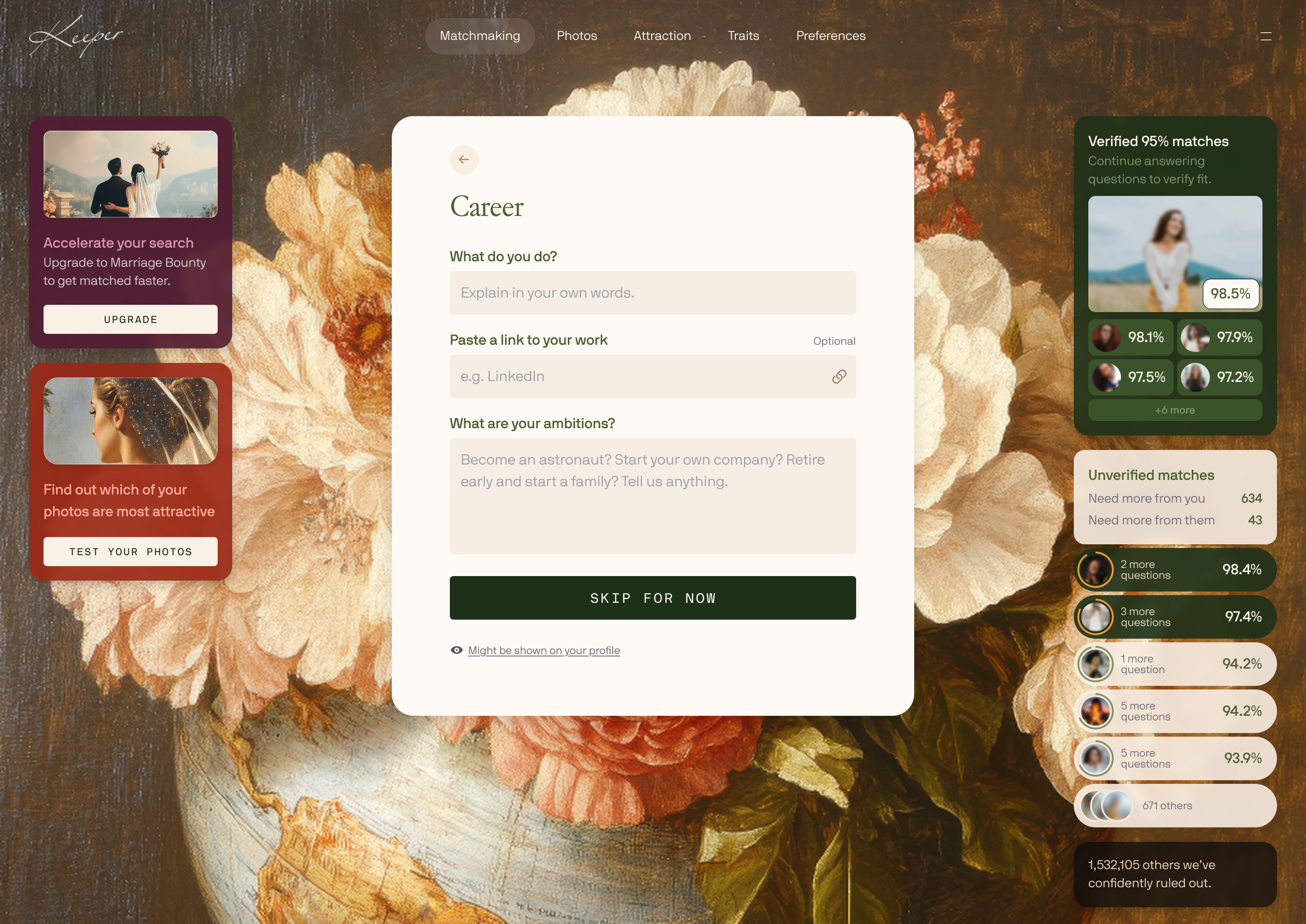
V3 also introduces live match previews right in the question answering flow.
As you answer questions, you'll see blurred previews of your current top matches, including:
This makes the process more transparent. You can see how your answers affect the pool in real time instead of filling out information into a black box.
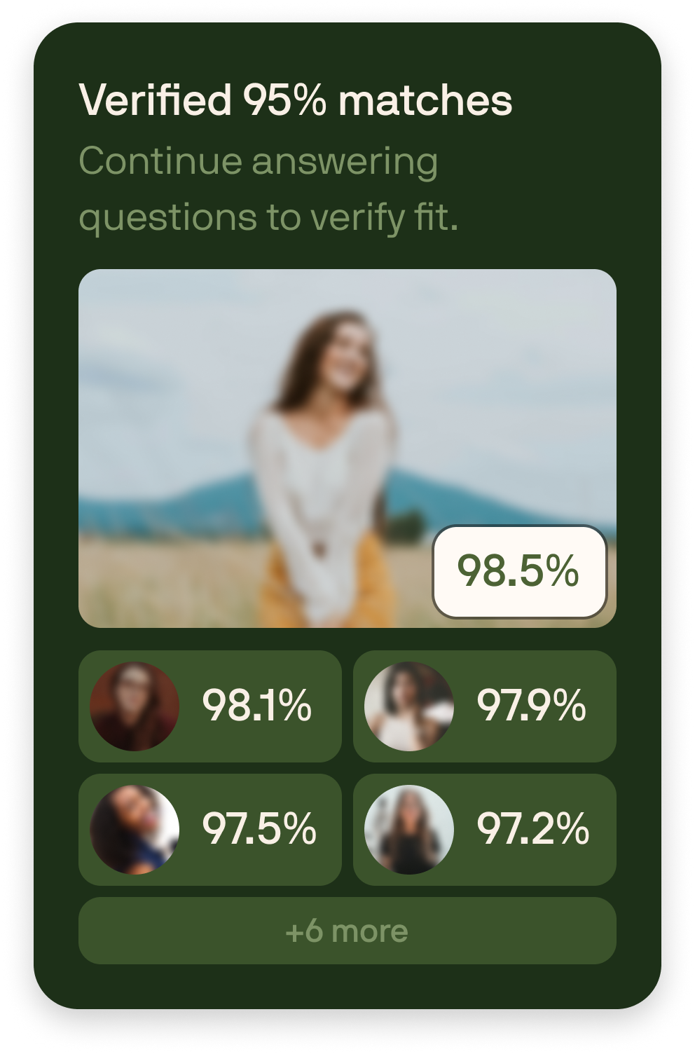
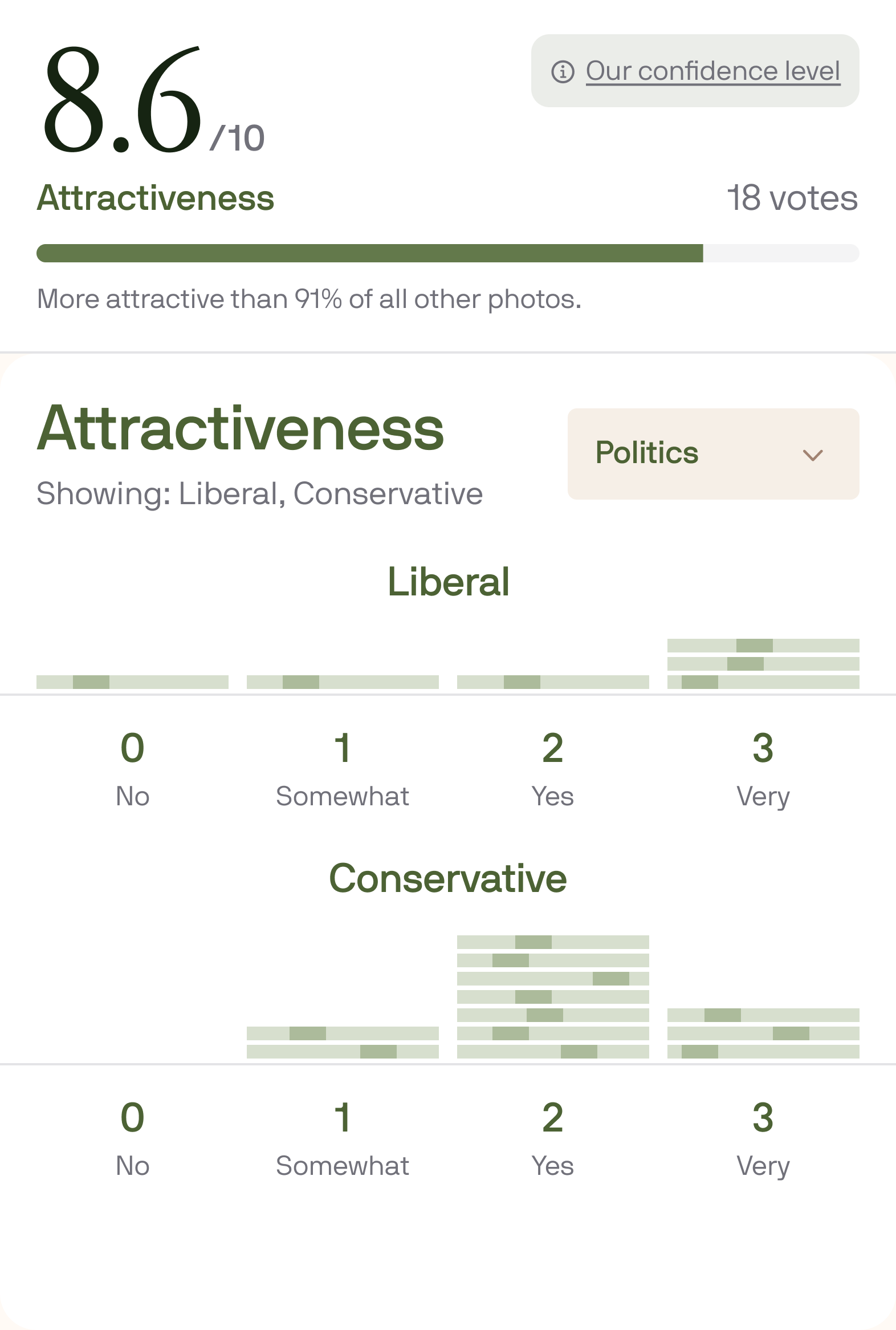
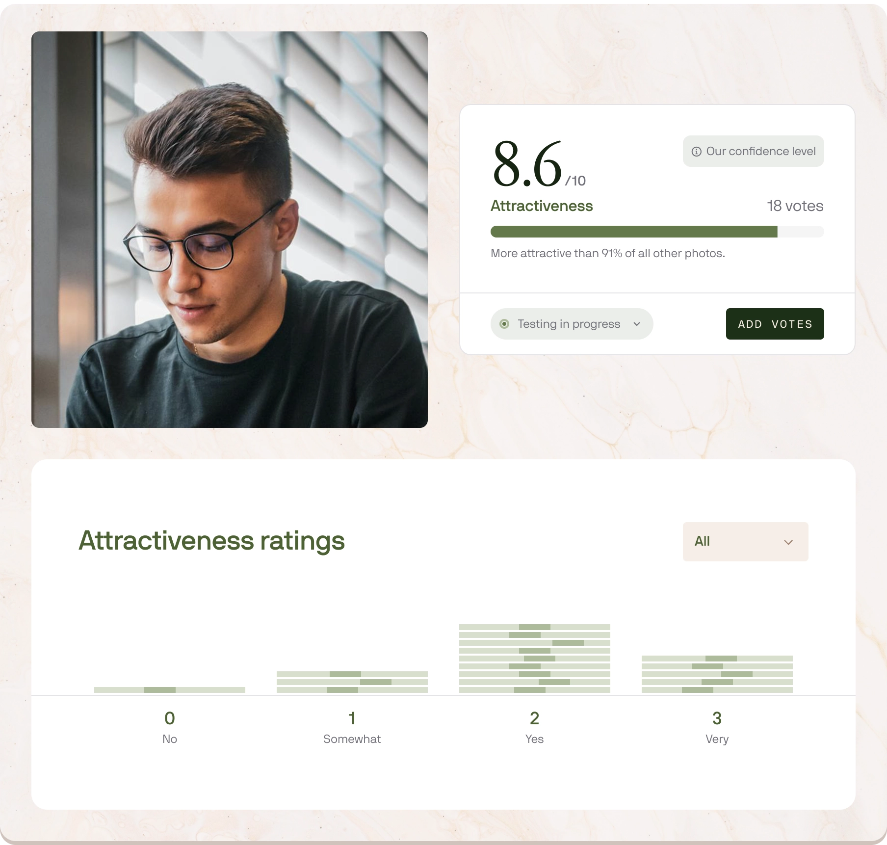
Photo Testing results are now more granular. You can now slice the ratings you receive by:
This helps you see who different groups rate the same photo, giving you a more nuanced understanding of how your photos perform with the people you care most about reaching.
This release adds more actional feedback to Photo Testing, ships a new version of our internal IQ estimation system, and improves several parts of the matching pipeline behind the scenes.
We also tightened up Photo Rating, Preferences, and onboarding with faster interactions, clearer next steps, and a set of targeted fixes across mobile and desktop.
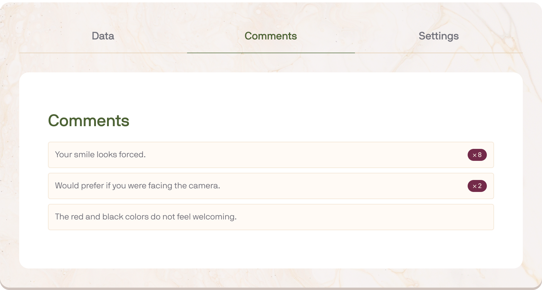
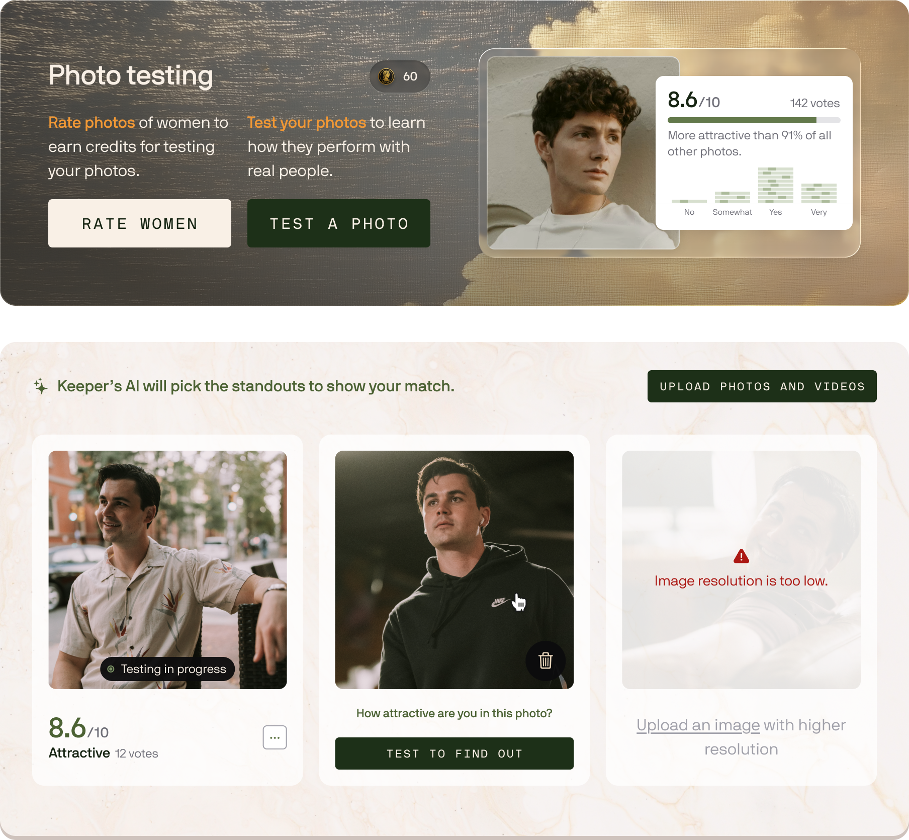
Photo Testing now includes written feedback from raters, giving you more context behind your scores.
When rating photos, users can leave comments explaining what they noticed. When viewing your own tests, you'll now see rater comments directly on the results screen, helping you understand why a photo performed the way it did — and what you may want to improve, replace, crop, or retake.
Scores tell you which photos performed best. Comments help explain why.
We released V2 of Keeper's internal IQ estimation system, which can now produce more nuanced estimates with confidence intervals for use by the matching engine and human matchmakers.
The system treats different signals with different levels of confidence. Direct cognitive or aptitude-test signals carry more weight; indirect signals like education, occupation, and other background information are treated more conservatively because they can be noisier and more dependent on opportunity.
The result is a confidence-bounded estimate that helps Keeper reason more carefully about cognitive compatibility.
We improved the speed and quality of backend systems that predict physical attraction and assess compatibility in the final stages of matching.
This includes a faster photo-score prediction system and a new version of our last-mile gestalt match assessment stage, which helps Keeper make more efficient final ranking decisions after earlier stages have narrowed the pool.
Keeper now supports same-sex matching. You can set the gender or genders you're interested in, and update your own gender and orientation whenever you like, all from Settings. This release also makes it easier to earn credits toward testing your own photos, smooths out upgrading, and turns our agent integration into a first-class Keeper Agent API.
Alongside that, we tightened the Photo Testing flow, made Preferences and Interests easier to fill out, and shipped a long list of reliability fixes across rating, settings, signup, and mobile.
You can now set the gender or genders you'd like to be matched with, and change your orientation from Settings. Same-sex matches are fully supported, and you can select more than one gender if you'd like to keep your options open. Existing members are already set up, so there's nothing to do unless you want to adjust it.
Testing your photos should be easy to start, easy to understand, and trustworthy when something goes wrong. This release makes the entire Photo Testing flow smoother, from uploading your photos to tracking credits, observing test progress, and handling photos that need review.
The biggest change is a new public Photo Testing path. Visitors can now experience the core rating loop before signing up: rate photos, understand how credits work, and move into testing their own photos with less friction. We also tightened the existing logged-in Photo Testing flow with clearer credits, better mobile results, faster rating sessions, validation refunds, appeals for flagged photos, and a long list of reliability fixes across rating, signup, phone verification, and the Standards Calculator.
We also continued laying the groundwork for the next version of Keeper's onboarding and agent-assisted experiences: stronger user-level auth, cleaner Agent API surfaces, dynamic-question infrastructure, richer match preview foundations, and faster/safer internal matching tools. Some of that is visible today as smoother onboarding and clearer profile flows; some remains behind the scenes until the full V3 experience is ready.
Users can now try Keeper's photo rating experience before signing up. The public Photo Rating flow lets a visitor start from the website, rate photos without logging in first, and experience the core feedback loop before committing to creating an account.
That makes Photo Rating easier to share and easier to use as a top-of-funnel product: users can feel the product first, then create an account when they are ready to test their own photos or keep going.
The main "Test a photo" action now takes you straight into uploading a photo, instead of making you choose through an extra modal first. We also cleaned up the start-test flow, improved the credit-selection experience, and updated website and calculator links so Photo Testing entry points route into the live flow more consistently.
Photo Testing now shows your credit balance before you start a test and makes the free-credit path clearer. While rating photos, you can now see progress toward credits earned in the current session, so the loop is easier to understand: rate photos, earn credits, and use those credits to test your own.
The mobile Photo Test results page has received a refresh, with cleaner layout details for attractiveness ratings. Photo tests also now handle validation outcomes more clearly: when a test is cancelled because a photo fails validation, credits are refunded automatically, and users can appeal a flagged photo. Approved appeals make the photo eligible for testing again; rejected appeals keep the photo unavailable and refund spent credits.
This release introduces a major upgrade to Keeper's matching engine: a new compatibility embedding model, bi-encoder retrieval system, and match-pair reranker designed specifically for romantic compatibility.
In our internal benchmarks, Keeper's language stack alone now ranks matches on par with Claude Opus 4.7 and GPT-5.5, at roughly one-tenth the cost per evaluation.
That matters because in matchmaking, the hard part is not evaluating one pair well. A great human matchmaker can do that. Frontier AI models can do that too. The hard part is doing it across a million pairs cheaply enough to be viable, accurately enough that the 1-in-a-million matches rise to the top.
The chart below shows where Keeper's language stack lands against the frontier models: how rare a match each system can reliably surface (vertical) against the cost of a single evaluation (horizontal). Keeper sits in the top-left, with frontier-quality ranking at a fraction of the cost.

And this is text only. Keeper's vision model, which judges photo compatibility signals that frontier models handle poorly, runs on top of this stack and pushes match quality meaningfully higher. The chart above is the floor, not the ceiling.
We trained a Keeper-specific embedding model for romantic compatibility.
Generic embedding models are good at finding text similarity. But finding the love of your life is about a lot more than similarity. Two people can look alike on paper and still be a poor fit, while two people who appear different on the surface may be highly compatible because of complementary goals, values, preferences, and other subtle factors.
Keeper's new compatibility embeddings natively understand that distinction.
In a pool of more than one million users, it's cost-prohibitive to run frontier models on every possible pair. Instead of using expensive reasoning on every pair from the start, our engine creates a compatibility-aware representation of each profile and quickly identifies the most promising candidates for deeper review.
We upgraded the final ranking layer of Keeper's matching engine with a custom reranker trained specifically on match outcome data.
After our retrieval system identifies promising candidates, the reranker decides which matches should rise to the very top. It weighs the signals that matter most in the final stretch: preferences, dealbreakers, lifestyle fit, values, stated priorities, and the softer compatibility patterns that are harder to capture with simple scoring.
In internal benchmarks, this reranker matches the quality of Claude Opus 4.7 and GPT-5.5 on language-based ranking while running at a fraction of the cost.
A major focus of this update was reducing false negatives: cases where a potentially strong match gets filtered out too early.
That is especially important in matchmaking because the best matches are rare. If the system is too aggressive early in the pipeline, it may eliminate exactly the kind of "hidden gem" match that should be considered in the final review set.
This update improves Keeper's ability to keep promising candidates in play while still filtering the pool aggressively enough to stay fast.
This release makes Keeper's matching engine:
This is a major step toward a matching system that can combine the nuance of expert human judgment with the speed, scale, and consistency of modern AI.
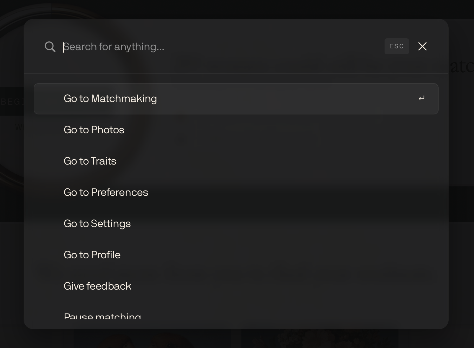
Today's release introduces a new spotlight-style command palette for getting around Keeper instantly, along with a broad set of improvements to our AI matching engine so we can surface better matches faster and at a lower cost. We also tightened up the Photo Testing flow with several upgrades around credits, test setup, and completion visibility.
You can now press Cmd+K (Ctrl+K on Windows) anywhere in the app to open a command palette for fast navigation and actions.
From the palette, you can quickly jump to pages across Keeper, including Settings, Photos, Traits, Preferences, and your Matchmaking Dashboard. You can also use the palette to give feedback, pause/resume matching, continue your next matchmaking task, and sign out of Keeper.
Behind the scenes, we shipped a broad set of updates to our AI matching algorithm to improve quality, speed, and matching efficiency.
In practice, that means:
This release introduces agentic onboarding for Keeper, making it possible for tools like OpenClaw or other AI agents to help manage your information on your behalf. We also shipped a new version of our Photos page with broad improvements across uploading, testing, and rating.
Keeper now supports an Agent API that lets external agents help you complete and manage your Keeper profile.
You can connect an agent either by generating an API key in Settings → Connected Agents or by approving an OAuth flow for local agents like OpenClaw. Once connected, your agent can do things like update profile details, answer questionnaire modules, run photo tests, check pool stats, and manage preferences.
We also shipped a new version of the Photos page with a broad set of improvements for a more polished experience uploading photos, launching tests, and earning ratings.
This is one of our biggest quality-of-life releases yet. It introduces voice onboarding with our AI matchmaker Selene, expands Photo Testing, and ships a wide set of frontend and backend optimizations that make Keeper feel faster, smoother, and more reliable across the board.
You can now complete Keeper's first two questionnaires by phone through voice onboarding.
Our AI matchmaker, Selene, will call your personal phone number and walk you through a friendly interview so you can make progress when typing isn't convenient.

We added a progress bar to Photo Rating so you can see how many credits you've earned in your current rating session, providing a clearer sense of progress and making it easier to know when you've hit your target.
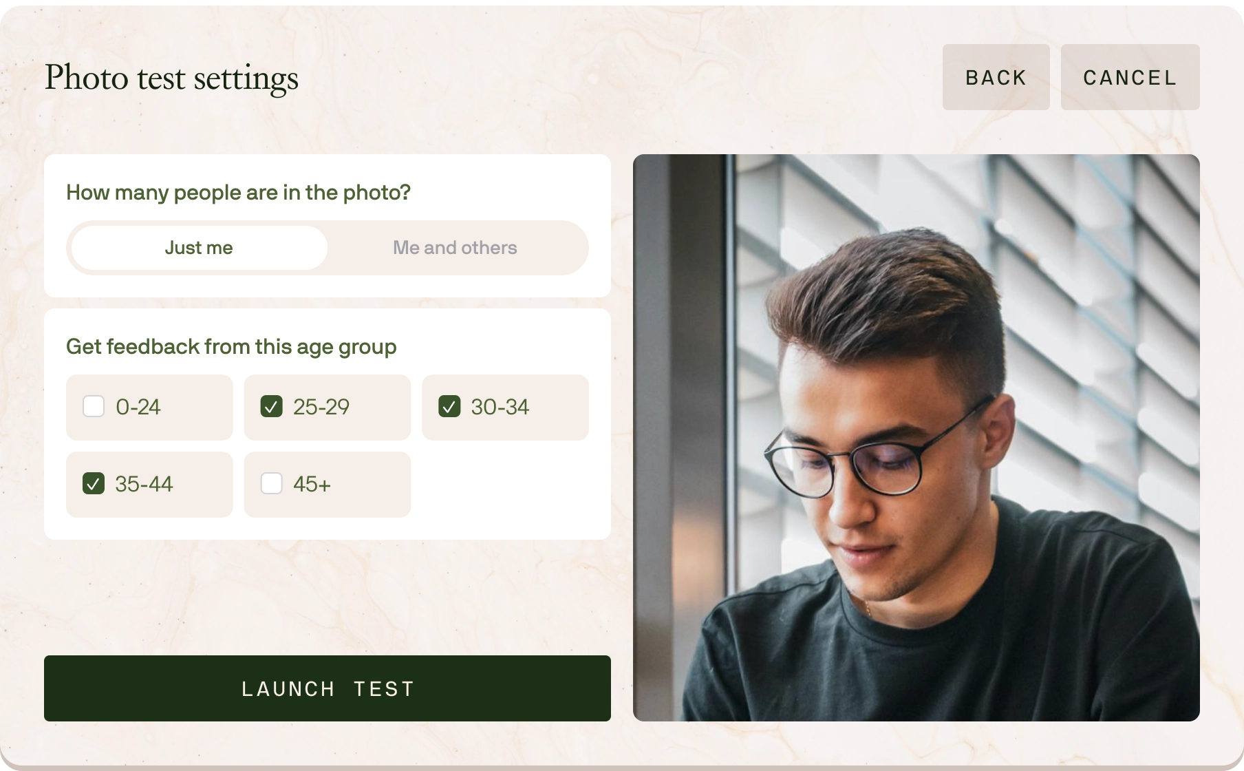
When starting a test on a group photo, you can now place a movable face tag chip on the image to indicate which person is you. This ensures you get accurate ratings for group shots and helps reduce ambiguity for the people rating your photos.
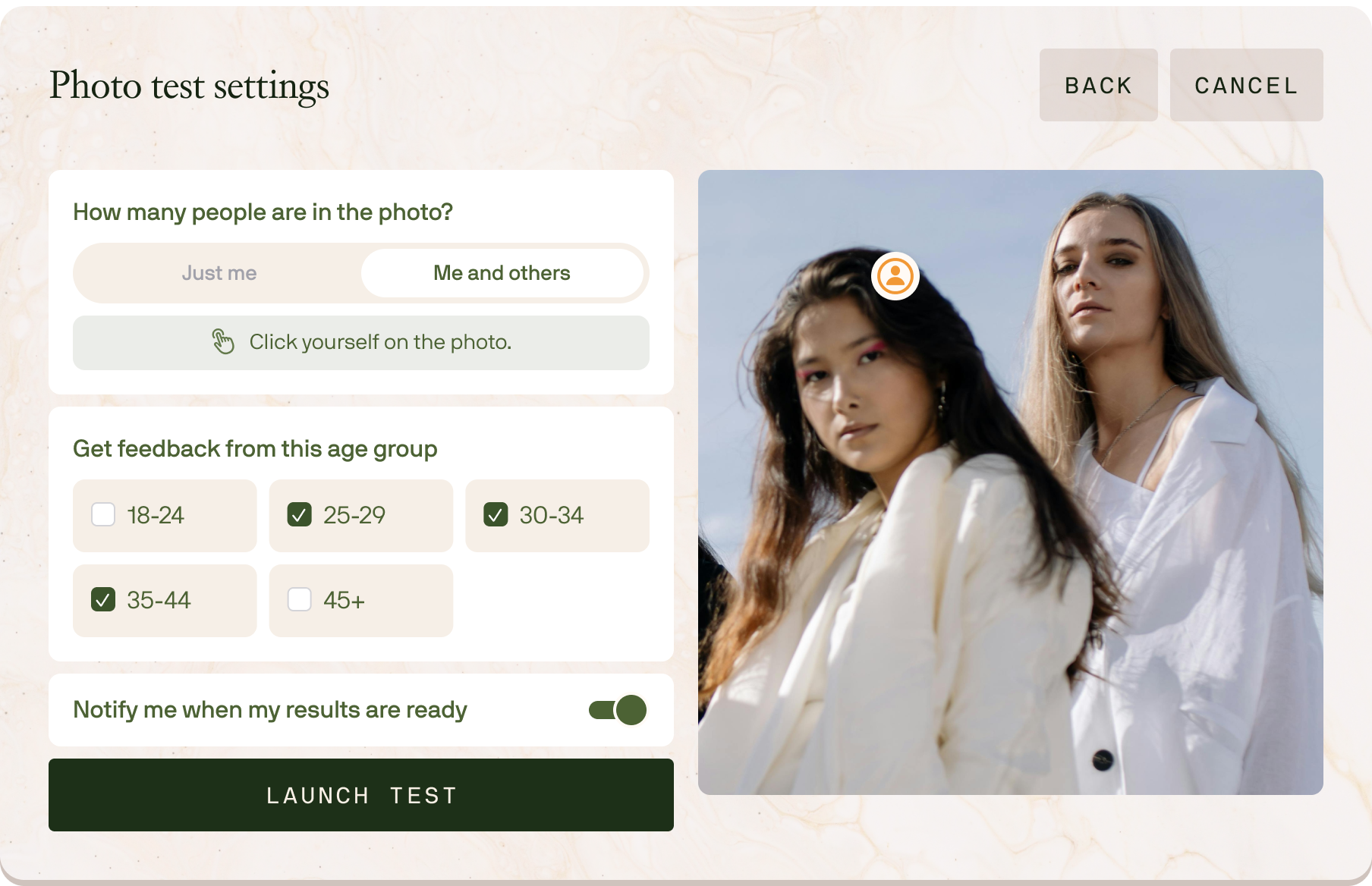
This release makes Photo Testing more informative and tunable while also ensuring you can return to Keeper exactly where you left off if you step away mid-flow.
We improved the Photo Test settings page with age range selection so you have more control over who rates your photos and can define test groups more intentionally.
We upgraded the Photo Test results experience to make results more granular and easier to interpret.
New additions include:
If you leave Keeper or close your tab in the middle of filling out a questionnaire, your draft progress is now saved and the next time you log in, we'll take you directly back to where you left off.
This release makes getting into Keeper faster, uploading content easier, and everyday interactions smoother across the app.
You can now sign in with Google OAuth or use passkeys (WebAuthn) for a faster, simpler login experience with fewer steps, more convenience, and stronger authentication.
File input fields now support clipboard paste, so you can Cmd/Ctrl+V screenshots and images directly into upload zones instead of saving files first and opening the file picker.
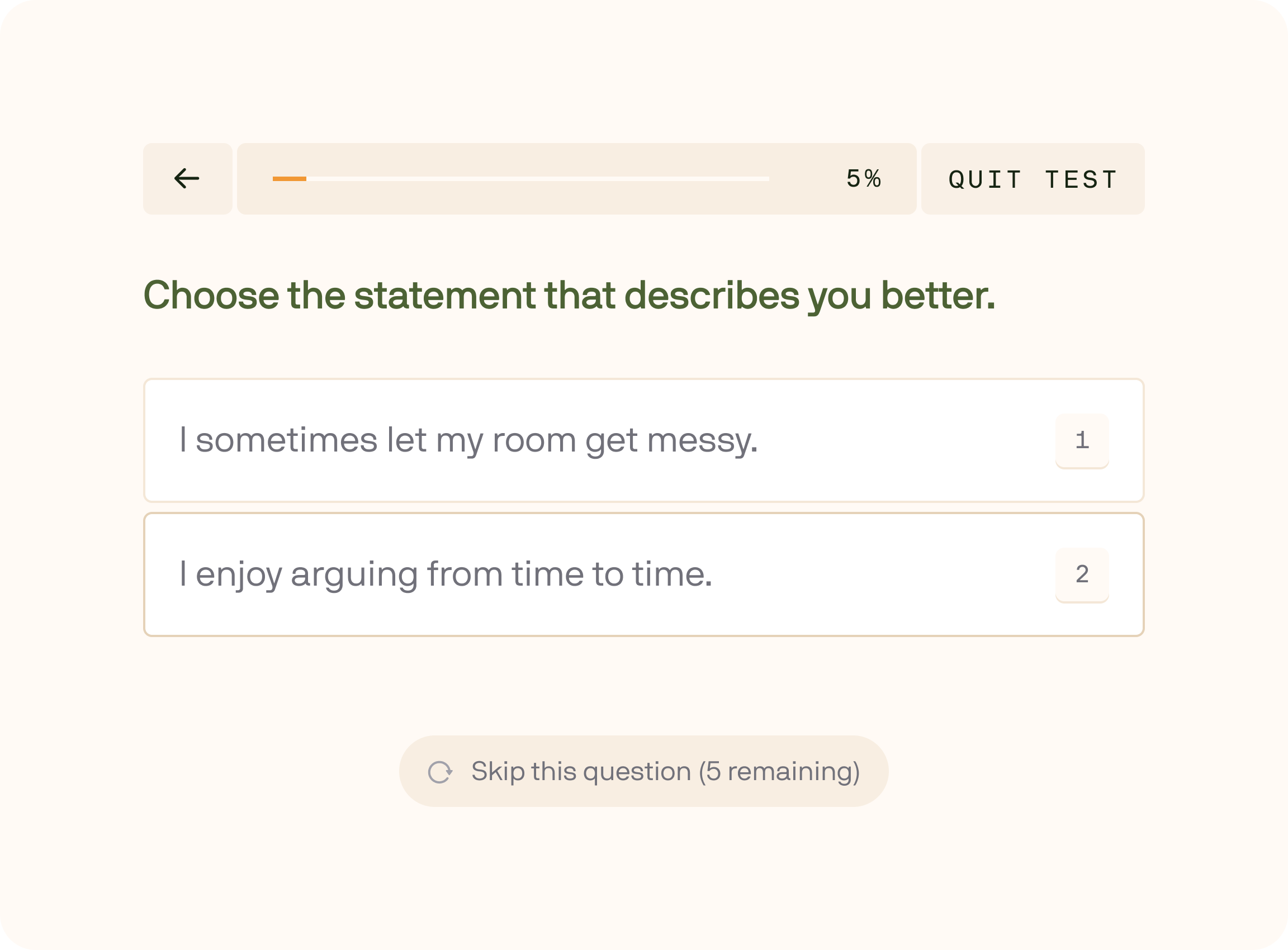
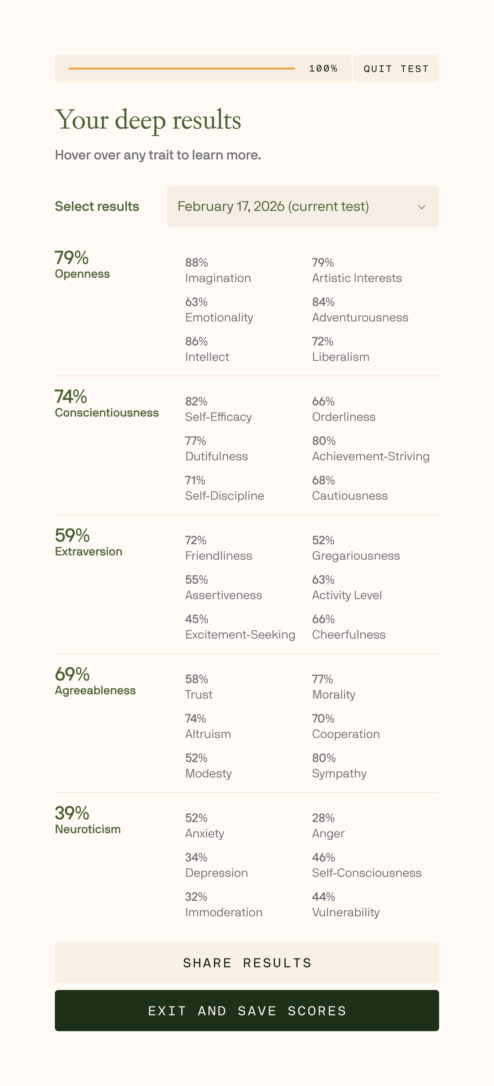
This release introduces our new proprietary Big Five (OCEAN) Personality Test, adds a clearer spam appeals process with human review, and delivers a wide set of UX improvements and fixes — especially on mobile.
We've begun rolling out our Keeper Personality Test to a subset of users while we calibrate scoring and question selection.
What makes our test different:
Take the basic version of the test to get your OCEAN scores: Openness, Conscientiousness, Extraversion, Agreeableness, and Neuroticism.
After completing the basic version, you can optionally continue into the Deep Personality Test to unlock full Big Five subtraits (facets).
If you don't see the Big Five test yet, just wait. We're expanding access gradually as calibration improves.
If your account is marked as spam by our automated system, you can now submit an appeal for human review.
A quality-of-life release across onboarding, photo testing, and everyday navigation — plus a handful of UI refinements to make Keeper feel faster and more stable.
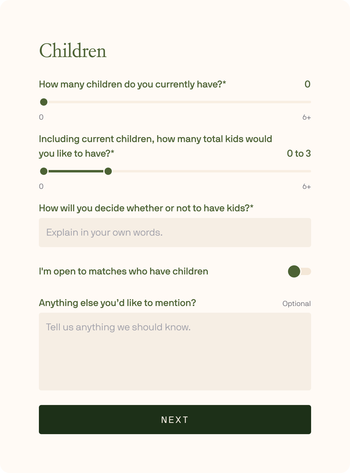
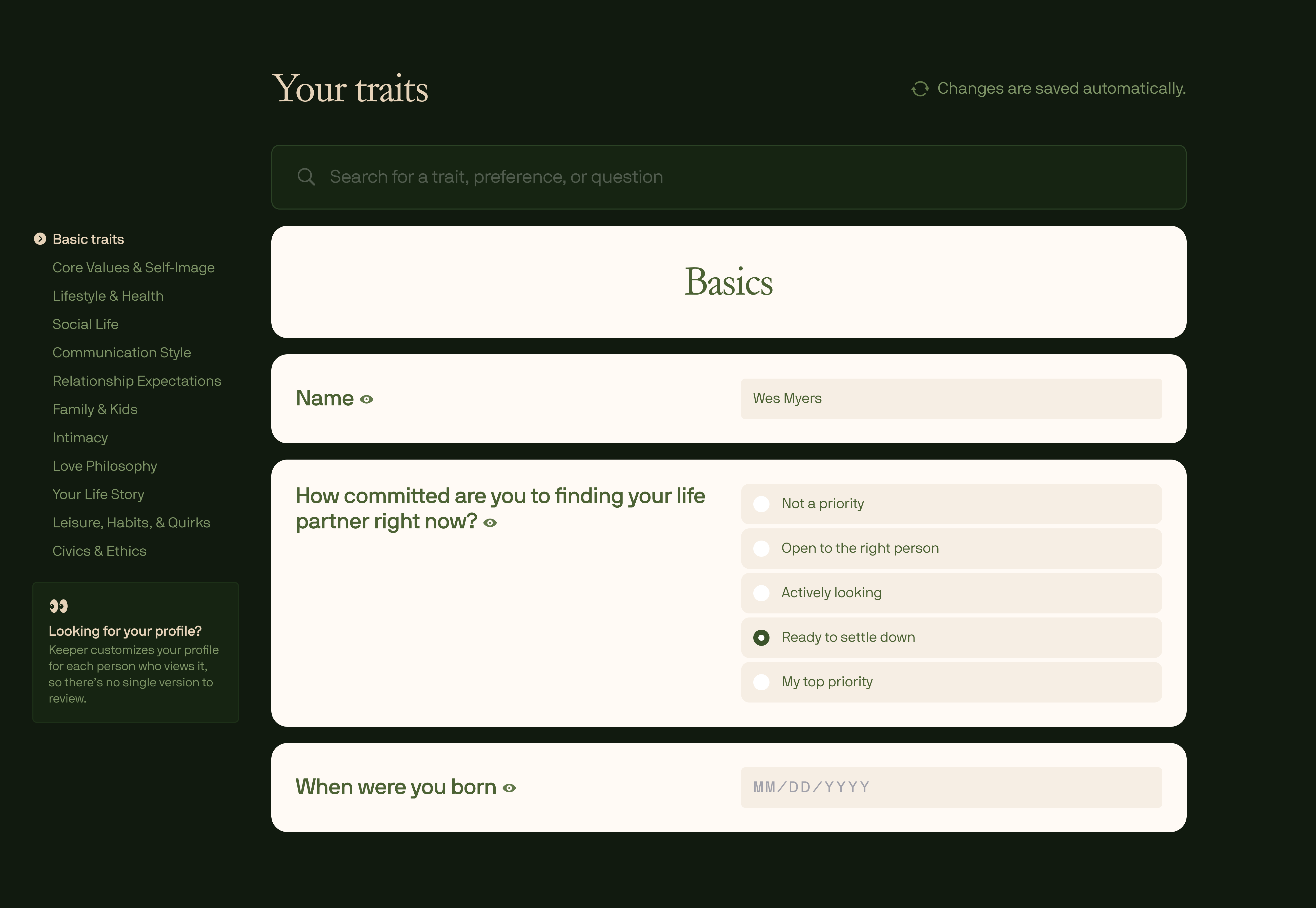
We added a free-text box to the Children question in Basic Traits, so you can share nuance about your thoughts on having kids (or having more).
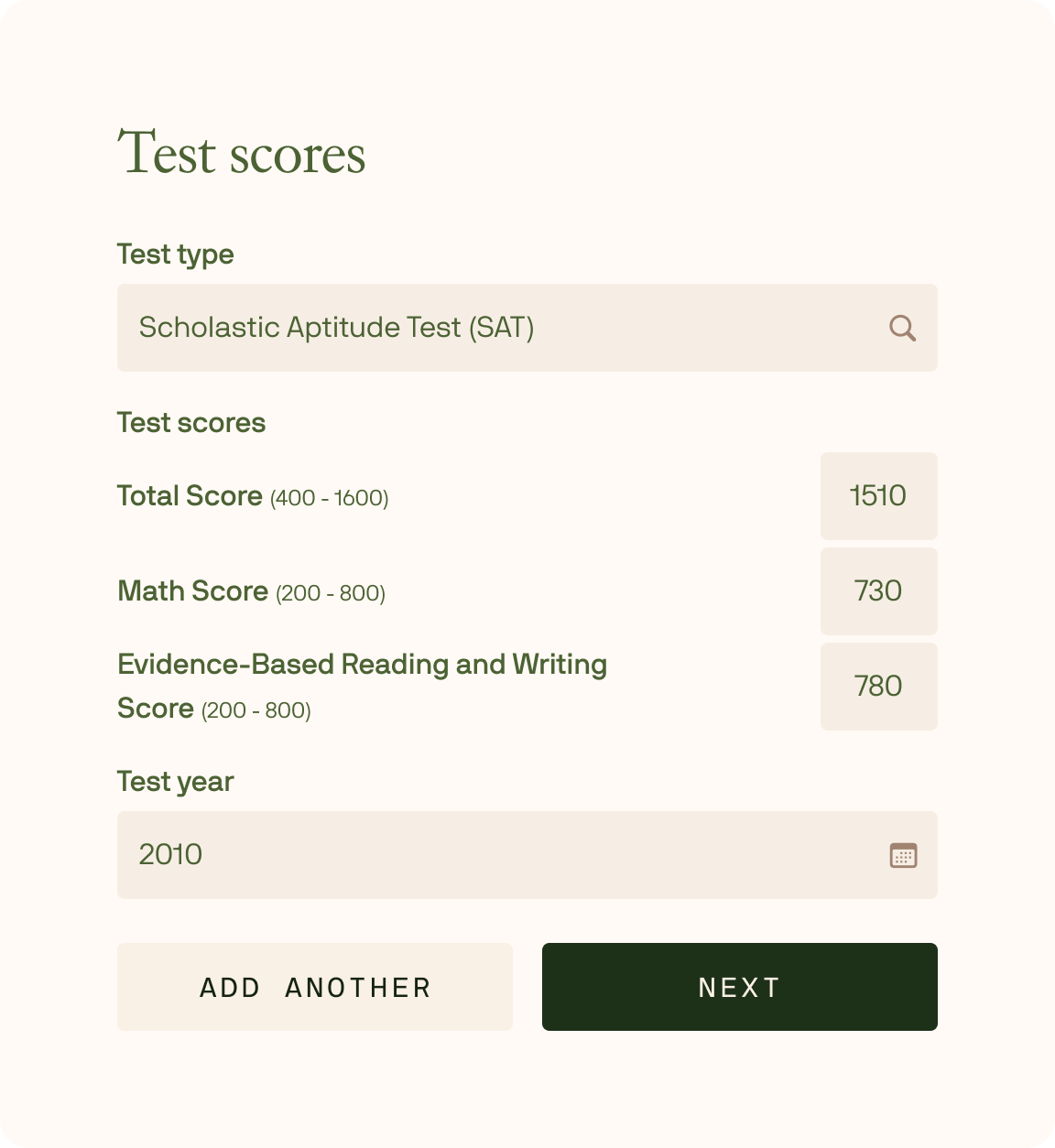
The Test Scores step in Basic Traits now shows score ranges for each standardized test to make entries clearer and reduce ambiguity.
When entering your phone number, the country code dropdown is now searchable by country name (e.g., typing "United States" surfaces +1). We also added smart country detection based on IP address, so the step can default to the country you're in when you begin.
When reporting a photo in Photo Testing, you're now required to include text feedback. This helps reviewers triage reports faster and take action more accurately.
We extended session timeouts and added active session refresh so you won't get logged out nearly as often during normal use.
This release is a broad set of improvements across the platform: better modeling of your physical “type” from photo ratings, clearer progress visuals, stronger account verification, faster loading across modules, and a long list of UI + logic fixes.
We improved how our algorithm learns your physical preferences from the photos you rate. This makes your taste profile more accurate and helps us filter and rank potential matches more intelligently — especially as you rate more photos over time.
We added animations to the Pool Transparency ring (and a few other key UI elements) to make progress feel more legible and satisfying — without changing the underlying stats.
We implemented SMS code verification for phone numbers to strengthen account security and improve overall account veracity.
Backend performance improvements mean modules and questions load faster, making the overall experience smoother — especially during onboarding and long questionnaire sessions.
We improved touchscreen interactions across the app so everything feels more responsive and reliable on touchscreen devices.
A polish-heavy release with refreshed artwork across the app, plus a set of fixes that improve reliability in onboarding, login, and photo rating.
We updated the fresco imagery on the Matchmaking Dashboard and every questionnaire module — cleaner, fresher, and more beautiful throughout the entire experience.

Today we're introducing Photo Testing, a new way to get anonymous, data-driven feedback on your photos so you can confidently choose what to use on Keeper.
You'll find it by clicking the Photos tab at the top of the app. From there, you can see the photos you've uploaded to Keeper, delete or upload more, and decide which ones you want to test.
Test a photo and receive anonymous ratings from men or women in your age range, summarized on a 0-10 scale. This gives you a clear signal on what's working and what isn't.
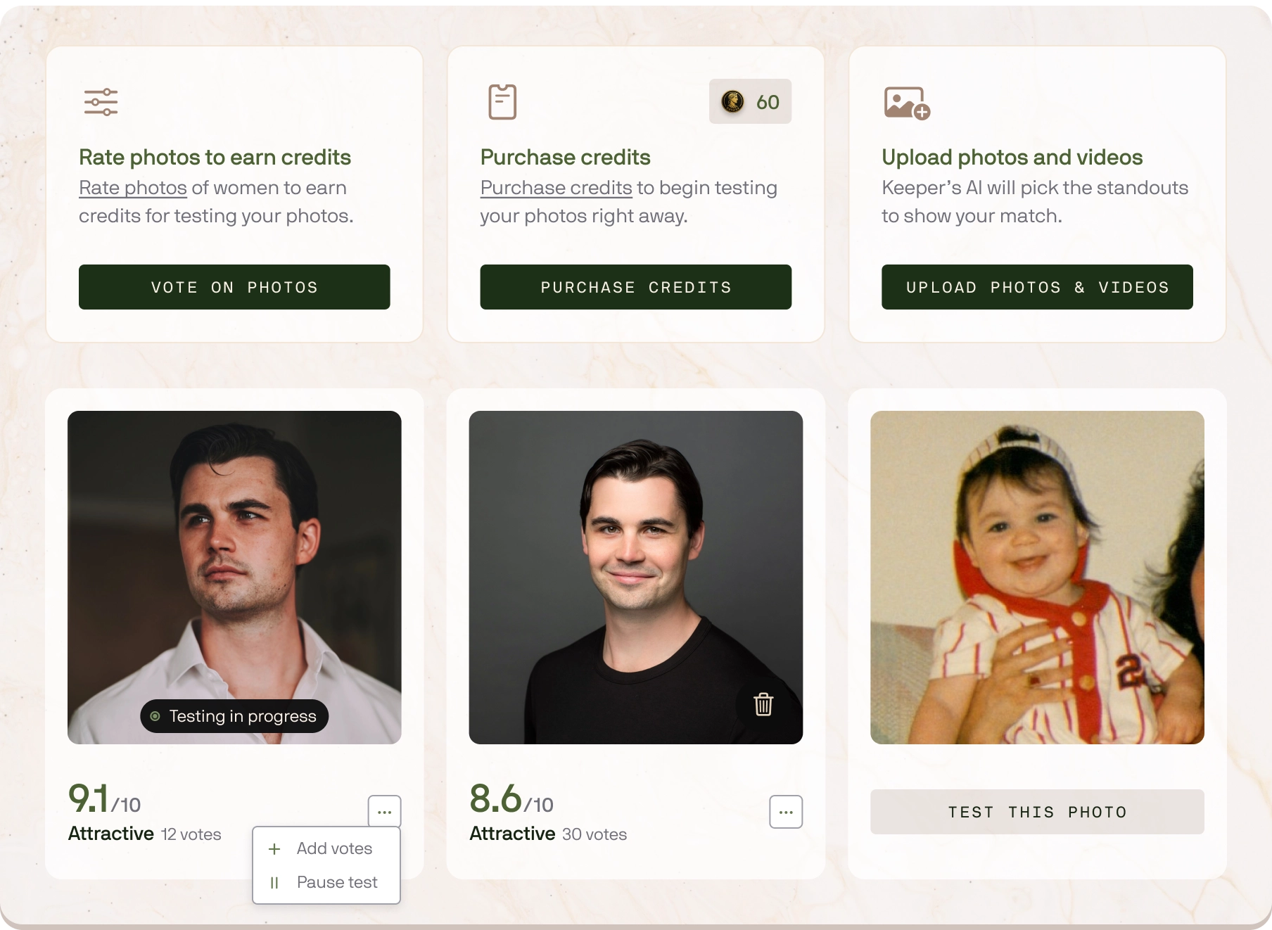
Photo Testing runs on credits. You can earn credits by rating other people's photos or purchase credits if you want to run tests right away.
For results that are statistically significant, we recommend collecting at least 30 votes per photo. Fewer votes can be directionally useful, but more votes reduce noise and makes comparisons between photos much clearer.

Your ratings on others' photos give us important signal to help understand what catches your eye. Every rating teaches Keeper what you're attracted to (and what you're not). Over time, this builds a taste profile that helps us check whether a match meets your preferences.
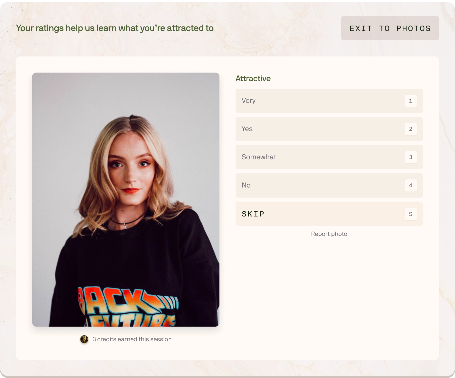
Photo testing helps us learn which of your photos are strongest overall and most consistently compelling across a broad set of anonymous ratings.
Then, when we show your profile to a potential match, we don't treat photo order as one-size-fits-all. We select and prioritize from your best-performing photos based on:
In practice: you still benefit from using your highest-quality photos, but Keeper also leads with the best photo for the specific person viewing your profile, optimizing first impressions without changing who you are.
Not everyone uses a rating scale the same way. Some people are consistently generous, others are consistently harsh. To prevent that from skewing outcomes, we normalize ratings across raters using rater-calibration techniques.
That means we estimate each rater's typical scoring behavior (their "baseline" and spread) and standardize their votes before aggregating them — so a chronically high rater doesn't inflate your scores and a chronically low rater doesn't suppress them.
This release is mostly small fixes, with one user-facing addition: a clearer explanation of how Keeper works and what "progress" actually means.
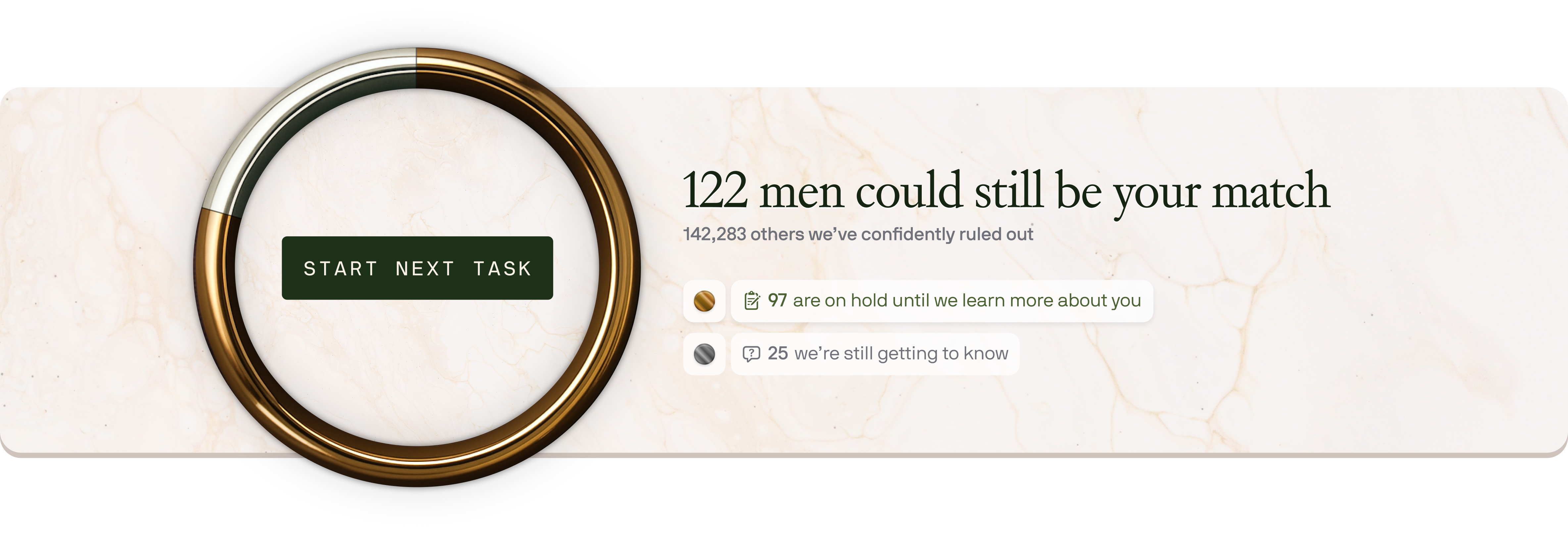
We added a "Where's my match?" link and modal directly from the Pool Transparency ring. It explains Keeper's process and clarifies the core goal of your journey. This makes the ring feel less like a mystery and more like a map.
A focused update that speeds up Pool Transparency, lets you complete modules from more places, and makes mandatory questions unmistakably clear.
We optimized the query behind your Pool Transparency statistics so pool re-ranking runs much more quickly as you add or edit information, so you see the impact of new information sooner.
All questionnaire modules are now available immediately after you sign up. You can complete modules directly from the Traits page (not only via the Matchmaking Dashboard), and you can set all preferences on the Preferences page.
We reworked how mandatory fields are handled, including UI and completion logic, so you are never confused about what you need to fill.
This release sharpens the AI pipeline so it moves faster, avoids false negatives, and scales under load — while also making preference editing smoother.
Match ranking now dismisses low-probability matches earlier, so pool transparency metrics update more responsively as you add information. We also tuned early-stage criteria to reduce false negatives, keeping promising candidates in play longer.
A major infrastructure upgrade ensures the AI remains reliable as our member pool continues to grow rapidly.
When editing a preference, you're no longer forced to merge or split entries if you provide more than one. If you prefer, the AI can interpret multiple preferences within a single chip.
Editing and ranking your preferences is now a much smoother, easier, and faster experience.
We merged the preferences editor and the preferences ranking view, so you can now add, edit, categorize, and rank every preference in a single place.
Copy on the preference ranking page is now simplified so each preference is easier to scan and update quickly.
Initial preference rankings now better reflect your stated priorities based on your original input, so you spend less time re-ordering them manually.
We tuned the drag-and-drop interaction for a smoother, more responsive feel and better flow.
Today's update is focused on speeding up top-of-funnel matching, sharpening UI clarity, and fixing a handful of issues.
We added a fast first-pass stage that uses structured (quantitative) signals to quickly evaluate candidates at the top of the funnel, deferring heavier semantic/embedding work to later stages. This allows for quicker initial rank matching and a more efficient pipeline.
Preferences now appear on the Preferences page much sooner after completing the Basic Preferences module, allowing you to rank your preferences immediately after submitting them.
We improved how preference constraints are interpreted and applied so rankings and transparency stay consistent with user-provided inputs.
Segment colors and widths on the pool transparency ring have been updated so categories are more visually distinct and easier to scan.
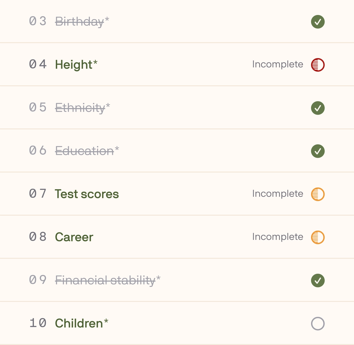
Today's update focuses on keeping momentum in your first weeks, reducing interruptions, and making skipped items obvious so you can get matched faster.
We now send a thoughtful email cadence during your first weeks on Keeper so you can stay engaged without guesswork. These nudges help you build a stronger profile, provide clarity into the process, and clearly explain where you are in your journey. You can unsubscribe anytime via the "unsubscribe" link in the email footer.
We reduced the frequency of the step-skipping warning modal so it appears only when it's truly helpful. This helps you maintain flow, especially during long sessions.
Where questions were skipped, you'll now see a universal incomplete icon with a tooltip explaining what's missing. This makes it easier to spot and fill gaps, which strengthens your matching signal and shortens your path to your best match.
You can now move through every question in every module without a mouse, using only your keyboard. It's faster, smoother, and more accessible for everyone.
While the examples above call out common field types, the mouseless UX is implemented consistently across all question types to feel natural and consistent, reacting how you'd expect.
If anything feels off or a particular field doesn't behave as expected, let us know! We're continuing to refine keyboard interactions based on your feedback.
Today's update makes drag-and-drop ranking smoother, saves as you go, and tidies up rough edges across the user experience.
You can now drag and drop a rank-order item from anywhere on its bar — not just the drag handle. This allows you to reorder faster with fewer mis-drags as you prioritize.
Every change now saves automatically when updating your preferences or personal information. No extra clicks, and it's safe to navigate away at any time.
We shipped several engine improvements that make your progress easier to read, speed up matchmaking, and prepare the platform for much larger scale.
We tightened how pool statistics are computed and aligned them directly to our evaluation stages. When a candidate enters the final stages of diligence, you’ll now see a “Promising match” indicator in Pool Transparency, so you’ll know when we’re close to a decision and what (if anything) is left for you to do.

We optimized the first pass of the scoring pipeline, eliminating a major bottleneck and delivering a 3x match evaluation speed improvement. This enables our algorithm to score, filter, and re-score broader candidate sets much faster. Updates to your information and preferences now propagate through the system more quickly with less lag.
We migrated profile embeddings to a dedicated vector database designed for high-volume similarity search.
Why it matters
You can now edit and rank your preferences in order of importance so we can fully understand the person you’re looking for and honor your real-world trade-offs when thinking about potential matches.
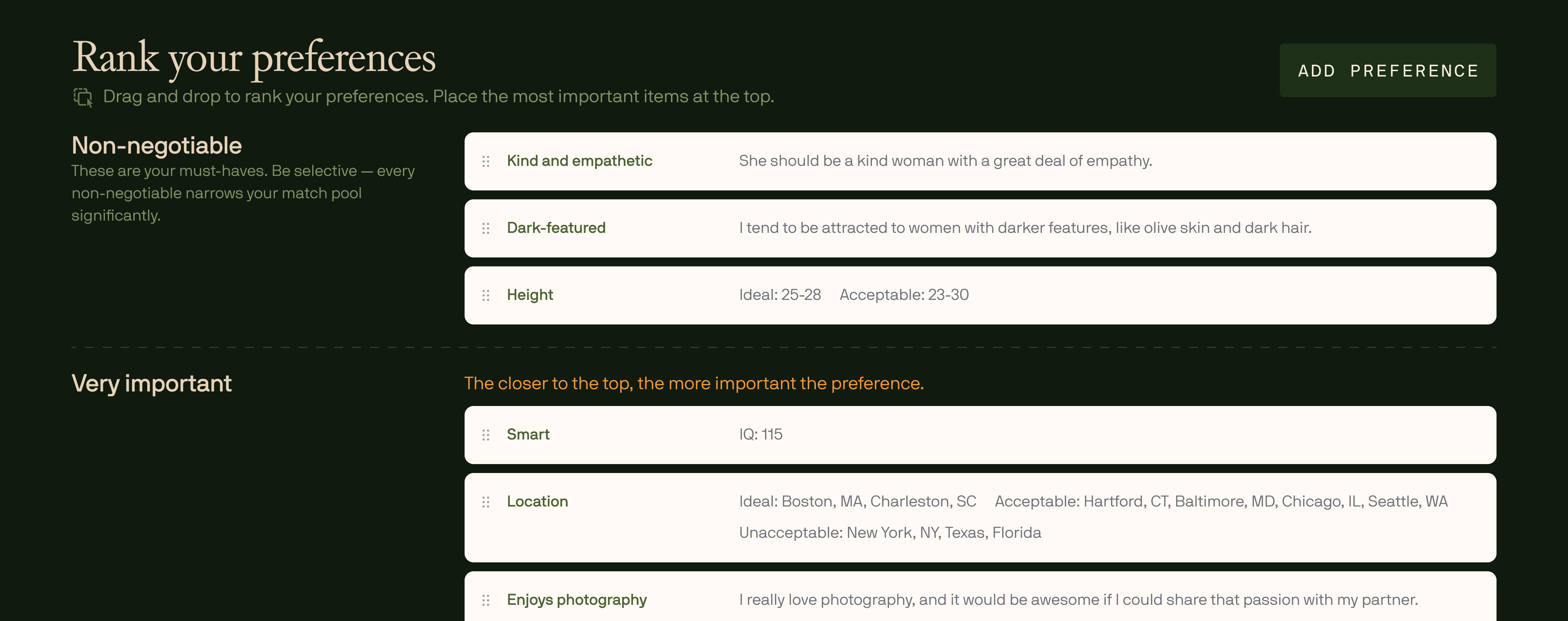
Open your Preferences view at the top of the page and add or edit the preferences that matter to you. The preferences you’ve already provided are auto-populated, with our best ranking assumptions based on how you originally described them.
Then, place each preference in a tier to establish their importance. The tiers are Non-negotiable, Very important, Somewhat important, and Nice to have.
Rankings within tiers matter, too. For example, the top item in “Very important” carries more weight than the second or third.
These tiers and ranks help our matching algorithm interpret what preferences must be met, what should be optimized for, and what’s optional, providing clarity for you and for us.
We've spent the last several months locked-in, rethinking every screen, flow, and minor detail. Today we're proud to launch Keeper V2, a top-to-bottom refresh of the platform focused on clarity, control, and measurable progress toward finding the right person
A refreshed look across the entire experience featuring a new color system, typographic scale, and classic fresco imagery highlighting the timeless romantic quest for the right person. The layout emphasizes readability and clear calls to action.
New and improved question formats create better UX variety and capture richer, more detailed information. As you work through the modules, you'll earn fresco rewards and provide higher-quality inputs that our quantitative and AI algorithms use to find your best match, faster.
These modules cover everything important to the information used to evaluate long-term compatibility: preferences, values, lifestyle, personality, dreams, and more.
See where you stand, with clarity. We now show you precise statistics detailing:
Update any previously provided information from a single, streamlined screen. Faster edits, fewer clicks, less context-switching. You can search for the exact field you want to change, and your updates sync automatically with our system.
Beyond these headline features, V2 includes numerous polish, performance, and reliability improvements throughout the experience. This is a major step forward and just the beginning of the V2 era. We'd love your feedback from real-world use — what's working great and what you'd like to see next.